QM-Extras: Making the Firefly Playing Cards
At QMx, we try to infuse everything we make with something "extra." Whether it's attention to detail, a unique twist on an old idea, or something novel and imaginative, we strive to give fans fresh, new ways to celebrate their favorite fandoms. QM-Extras lets you in on our world to show you how we make that happen.
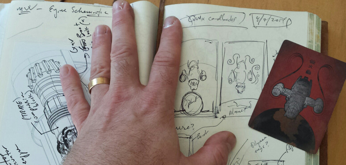
For our first QM-Extra, we caught up with Browncoat artist Ben Mund to talk about the creation of our Firefly Playing Cards.
It could be argued that artist Ben Mund has seen more of the Verse than virtually anyone on the planet. After all, the artist known as "Whitefall" has worked with QMx closely over the years to infuse his highly detailed design aesthetic into several Firefly products, providing fans a much-needed visualization of the Verse that never received due time on-screen. So when the time came to create a set of playing cards for Firefly, we knew who we had to call to make it great.
Read on for our Q&A with Ben where we discuss his trademark art style and his approach to the deck's design, then stick around for a bonus downloadable goodie at the end!

For those who don't know your background, could you tell us a little about yourself and how you got started in the Firefly business?
I’m a graphic designer by day, and as anyone who does any sort of digital design can tell you, the tools change constantly. I also happen to be a huge sci-fi fan, so I started reflecting some of my favorite films and shows in my personal work as a way of keeping my skills sharp.
I met QMx CEO Andy Gore through a comments board. I loved QMx’s products, so I started asking him questions. One thing led to another and they brought me on board to do a replica of Serenity’s ship papers. Since then I’ve worked on a number of other projects, including the Serenity Blueprints (with the amazing Geoffrey Mandel), a map of Serenity Valley, the official Atlas of the Verse, and others.
You're known in the fan community for your intricate designs. How did that develop?
Probably through the stuff I like to consume. I’m a huge Blade Runner fan, for example. The detail in that film blows my mind. Every time I see it I spot something new, and even better, something internally consistent. I love the long-term payback that type of layered detail can deliver.
That’s definitely an inspiration and something I tend to shoot for — ways to give a little extra value to the customer the more they consume the material. I did it pretty heavily in the Atlas: there are references in there connecting to the show, to the Serenity Blueprints, even to the expanded material.
It’s just trying to make it all feel like it belongs to the same world — in the big details and the small.
What was your process and design inspiration for this deck?
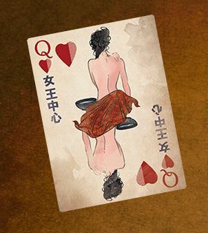
 We wanted to make the deck something that could believably be picked up and played with in an episode of the show, more or less. That’s why we chose to go with more abstract images of people rather than direct character pictures. For example, the Queen of Hearts isn’t literally supposed to be Inara: it’s supposed to represent a Companion. Same with the Independent Soldier and the post-war Browncoat — they’re intended to represent Browncoats, not literally Mal.
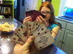
There were some concessions made because we wanted to include as much iconic imagery as possible, without resorting to the standard images of the actors. You’ll see a parasol and some familiar weapons, but the biggest "not-really-in-universe" item is Jayne’s hat as the Joker — just couldn’t pass that one up. I also did a lot of weathering on the cards to help them feel more in-universe. Stains, stickers, and even greasy fingerprints (with a scrawled note from a mechanic) all help make the cards feel like they’ve been sitting in a Firefly’s mess hall for a few too many years.
Fans may also notice that there are no ad cards in the deck as there would normally be. QMx wanted to add a little something extra, so instead of ad cards there are replicas of the Tall Card betting slips from the show — they're intended to be used as autograph collection cards.
Rumor has it there's a hidden Easter egg in the design. Could you give fans a *teensy* hint to point them in the right direction?
There is, and it’s not one of the little things that appear on any single card. You need to look a little larger than that. I guess the hint I could give is to remember Mal’s unit from the war.

What's your favorite design in the deck, and why?
I’m partial to the red queens— the Companion. I think they managed to come out peaceful and mysterious. I also like the fact that I got to stain stuff on purpose, rather than my usual method of accidentally spilling coffee over everything.
Anything else you'd like to add?
I’d love to talk to anyone who’s picked up deck! You can reach me on Twitter (@benmund) or see more of my geek-related work at benmund.com.
BONUS: As a thanks for sticking around, Ben designed a Firefly-themed cheat sheet of poker hands that you can download. Not only is it handy for your next poker night, but it's also a great way to preview some of the shiny art from the Firefly Playing Cards.
To download it, simply click on a link below to open it, then right-click to save:
What's your favorite design in the Firefly Playing Card deck? Tell us below!
Find QMx on: